 Amber
Amber
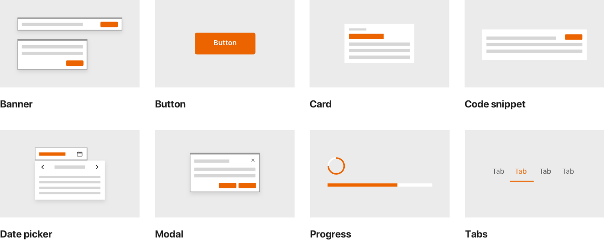
Overview
The main goal of the Amber Design System components implementation is to provide a set of small and usable widgets that are also easy to use for anyone who is pratical with HTML and/or Javascript.
For instance to use a tabs widget, all you have to add in the document body is:
<amber-tabs labels="Easey peasy, Pratical widgets">
  <amber-tab-content>
    <p>Is it really this easy?</p>
  </amber-tab-content>
  <amber-tab-content>
    <p>And also very pratical!</p>
  </amber-tab-content>
</amber-tabs>
to get this result:
Is it really this easy?
And also very pratical!
A fully working, styled and interactive element!
At the same time we wanted to have our components library to be as light as possible for both the network bandwith and browser's parser, so we developed it with standards in mind and using just a few tools/library that could help us:
WebComponents
The WebComponents specification is an umbrella term to group the Custom Elements v1 and Shadow DOM v1 specification. These browser APIs let you write W3C compliant custom HTML tags with their own functionalities, scoped styles and markup that works across browsers and frontend frameworks.
Typescript
To achieve a better code resilience, all components are written in TypeScript to take advantage mainly of static type checking and the decorators syntax. It is also used to transpile code to ES-2015.
Based on Lit-HTML & LitElement
Since Web Components as a standard doesn't handle the rendering mechanics and data-binding, we are adopting Lit-HTML and its Web Component class LitElement as a foundation layer for every comoponent within this library.